


Without any hesitation, Erik Sundberg knew exactly what it meant to be a red or blue state.
The University of Minnesota electrical engineering freshman naturally associates colors with liberal and conservative ideals, like most people.
This connotation, although common, may seem like a long-established part of the American political lexicon, but analyzing designs and colors that identify campaigns is a relatively new concept.
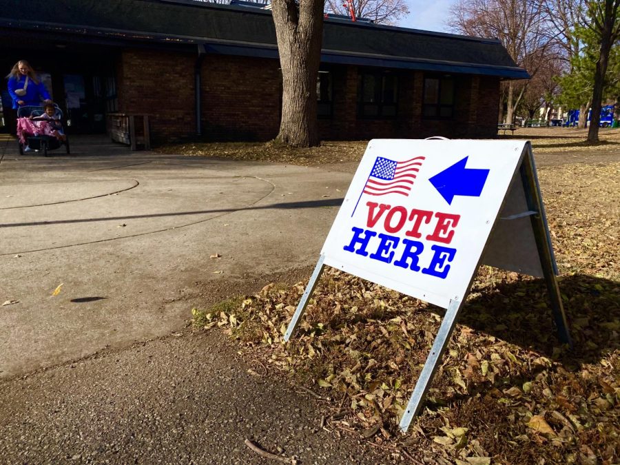
With less than six weeks to go until Election Day, campaigns for Minnesota governor, the U.S. Senate, the U.S. House of Representatives and other offices are in full swing, and political signage — along with television and radio advertisements — could help decide the outcomes.
This election cycle features a wide array of logo designs, all intended to paint candidates’ identities and catch voters’ interest.
It was only after the 2000 presidential election that candidates started consistently using colors and other identifiers in their campaigns.
Associations with color change over time, said Carol Waldron, a graphic design associate professor who specializes in color theory and typography.
While purple, once considered a product of royalty, has lost its original association, red has retained its status as a color of boldness, she said. And over time, blue still represents loyalty, while green suggests growth or nature, Waldron said.
“With almost any kind of visual material we encounter, we’re — consciously or not — making associations with things we’ve encountered in culture and in our lives,” she said.
As campaign advertisements fly at students and Election Day nears, writing studies associate professor John Logie said there are benefits of stepping back and considering the meanings behind the images.
Logie, who specializes in rhetorical theory, provided the Minnesota Daily with a detailed, examination via email of campaign signs that appear in Minnesota elections as Nov. 4 nears. Here is his analysis:
Secretary of State
Steve Simon, Dfl-St. Louis Park, vs. Dan Severson
Simon uses a default red, white and blue color scheme while omitting his party affiliation. However, the heavy use of blue emphasizes his background as a Democratic-Farmer-Labor state representative.
Severson also tries to indicate his party affiliation through color, but the placement of the blue ribbon with white stars over a red backdrop almost evokes the Confederate Flag — an odd choice for Minnesota.
U.S. House congressional district 4
Betty McCollum, D-Minn., vs. Sharna Wahlgren
In Minnesota, McCollum’s maroon-and-gold color scheme implies an association with the University of Minnesota, and the St. Paul campus lies in her district. She has used “Betty” as a campaign feature throughout the past decade, a choice perhaps originally intending to emphasize she would be a woman representing Minnesota in the U.S. House of Representatives.
Wahlgren’s sign is unconventional in its choice of a bright purple background and flowing script. (Wahlgren said, however, she chose purple to represent centrism.) Like McCollum, the use of her first name emphasizes that she’s a woman running for the office. Like Daggett, party affiliation is perhaps avoided due to the left-leaning history of the district.
U.S. House congressional district 5
Keith Ellison, D-Minn., vs. Doug Daggett
Ellison’s green and white design pays a noticeable homage to the late Minnesotan and Democrat, Sen. Paul Wellstone.
Daggett, perhaps in an attempt to “out-Wellstone” Ellison, has adopted the green-and-white color scheme as well as Wellstone’s signature exclamation point. Party affiliation is noticeably missing, which is maybe because he’s running in one of the most left-leaning districts in the state.
Governor
Gov. Mark Dayton vs. Jeff Johnson
With basic typeface and a conventional red, white and blue scheme, Gov. Mark Dayton perhaps signals patriotism and bipartisan commitment and the red silhouette of the state set against dark blue could position Minnesota as a conservative state.
His challenger Jeff Johnson’s sign focuses on delivering a clear “red” alternative to the “blue” incumbent. (Waldron said the sans-serif block font recalls the one President Barack Obama used successfully in 2008. This type of font, she said, is more modern and works well for signs.)
U.S. Senate
Al Franken, D-Minn., vs. Mike Mcfadden
By using yellow, white and blue — and avoiding any red — Franken’s color scheme underscores his political stances in relation to the GOP. Unlike his 2008 sign, “Democrat for U.S. Senate,” Franken embraces the state of Minnesota with “U.S. Senator for Minnesota.”
Mike McFadden takes advantage of his initials to try and create an iconic logo. The orange and light-blue ‘M’s’ make a sort of purple, which is a bipartisan symbol. The white backdrop could be a callback to Obama’s 2008 campaign signs that sought to frame him as a political outsider.