It’s just a coffee mug, but to Minnesota’s women’s swimming coach Jean Freeman it serves as a constant reminder.
“Things do not change,” an inscription on the mug in her office reads. “We do.”
Not so long ago, Freeman was one of the coaches at the University fighting to preserve the school’s 27-year-old system of separate men’s and women’s athletics departments.
Now, after losing that battle and witnessing the merging of the two departments into one last summer, things are changing on the Twin Cities campus.
One of the most visual changes is the retirement of the “Ms.” logo that represented Minnesota women’s athletics since the women’s department was established in 1975.
Making the switch
When Joel Maturi arrived as the first athletics director of a merged Minnesota athletics department last August, one of his first orders of business was to determine what to do about the dual logos.
“I know how meaningful the ‘Ms.’ was to the women’s department and to those people who worked so hard to develop an identity for women’s sports here at the University of Minnesota,” Maturi said.
“So, I thought what was appropriate was to ask the people it most affects.”
Maturi conducted an informal survey of coaches, athletics supporters and student-athletes requesting their thoughts on what should be done.
The results were overwhelmingly one-sided: Every athletics team at the University should use the classic block “M” as its logo.
Student-athletes on 24 of the 25 Minnesota intercollegiate sports teams voted to make the switch.
Maturi declined to name which team voted to keep the “Ms.”
After receiving such a clear response from the people within the school’s athletics program, Maturi decided it was time to change.
“Last year we told the Big Ten we were using just the ‘M,’ ” Maturi said. “However, I told our coaches they could do what they wanted in their media guides and their releases for the 2002-03 athletic year.
“I’m truly respectful of that period of history in Minnesota athletics but there seems to be resounding importance that we should move forward.”
‘M’ is for Minnesota?
Unlike Freeman, who has been on campus since her days as a student in 1968, Minnesota women’s hockey coach Laura Halldorson was not around to witness the evolution of the “Ms.”
But Halldorson understands the significance of the logo debate as well as anyone.
When Halldorson was named the first-ever coach of Minnesota’s women’s hockey team Oct. 23, 1996, she had to decide on a symbol to represent the new program.
She can still remember it being a hot topic and the arguments on both sides of the debate.
“Some people took the ‘M’ to mean men’s athletics and the ‘Ms.’ to mean women’s athletics,” Halldorson said.
After careful consideration, Halldorson and her staff decided to create their own logo, specific to Minnesota women’s hockey.
“It was just to stay out of the controversy,” Halldorson said.
That logo, designed by Minnesota women’s gymnastics coach Jim Stephenson, included the classic “M” with a zigzagging hockey puck swooshing by – which Halldorson said might or might not be viewed as an “s.”
Five years later, with the opening of the new Ridder Arena, Halldorson chose to have the classic “M” displayed at center ice of the first arena in the country built exclusively for women’s hockey.
“It’s a philosophy that goes along with the merging of the departments that we want a logo that says the University of Minnesota,” Halldorson said.
In July, Halldorson ordered new uniforms for her players, who for the first time will wear the classic “M” on their jerseys.
Maturi said he is not forcing any coaches or teams to purchase new uniforms to speed up the transition process, but said when new equipment is ordered the switch will be made.
“The ‘M’ never stood for men, it stood for Minnesota,” Maturi said. “That’s the way it has been accepted.”
Changes on campus
It has not been a drastic change, but slowly the Minnesota campus is ridding itself of the “Ms.” logo.
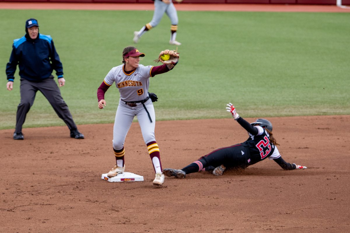
The “Ms.” which used to adorn the center field wall at Jane Sage Cowles softball stadium has since been replaced with the “M.”
Visitors to the Bierman Athletic Building who were once greeted by both logos at the main entrance now see just one.
The Gold Country campus apparel stores that sell official University merchandise no longer stock or print anything with the “Ms.”
“When (the administration) decided to unify everything we just went with it,” Gold Country Operations Manager Scott Bitter said. “We’re going to carry the stuff that people want.”
But there are exceptions.
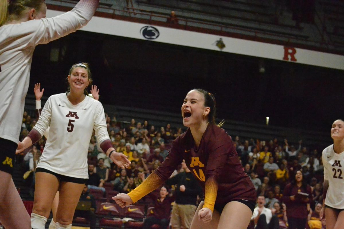
The Sports Pavilion, which hosts men’s and women’s gymnastics, volleyball and wrestling events, still proudly sports the “Ms.” on the western exterior of the building and above both scoreboards inside.
Memorializing the ‘Ms.’
Maturi said no plans have been made yet to memorialize the “Ms.” logo, but that he would consider options to do so in the future.
“Symbolism is a part of what we do,” Maturi said. “It’s important to recognize that. At the same time, people can read too much into it.”
Freeman is hoping the University will eventually decide to pay tribute to the logo in the form of some permanent memorial to keep it from being forgotten.
“It is significant,” Freeman said. “It’s part of history. It’s just like anything else; once you take it away it becomes more precious. You don’t shove it under the rug.”
In the meantime, she continues to make the adjustment.
“I’m capable of change,” Freeman said. “It just takes time.”
Brett Angel welcomes comments at [email protected]


