


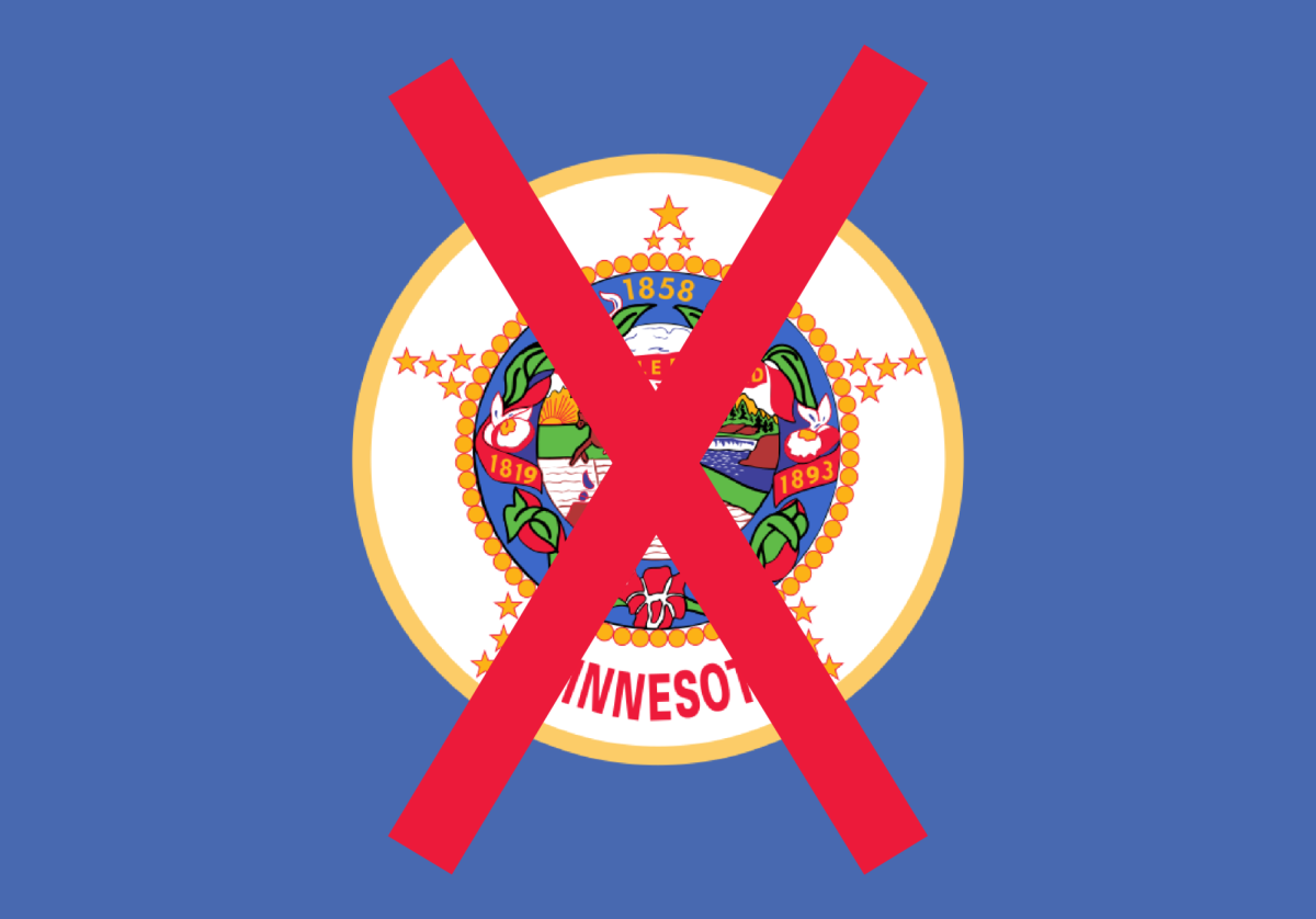
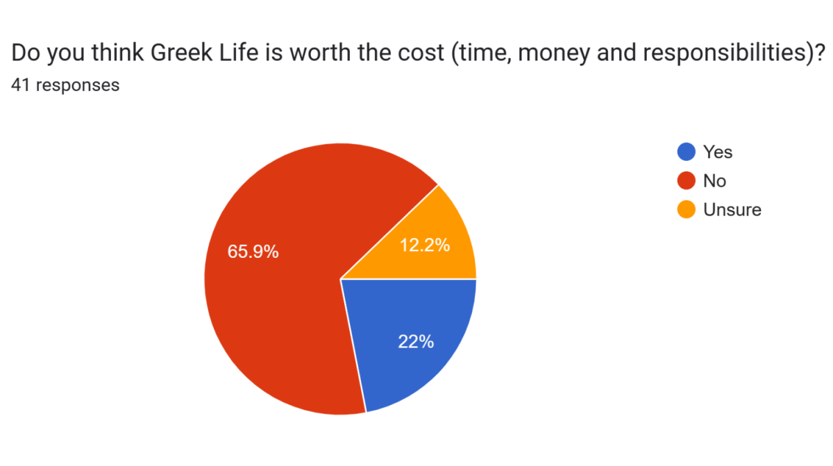
Have you seen the new concepts for the Minnesota state flag? Mid, right? That’s what I thought. We here at the Minnesota Daily wanted to see what you, our dear readers, had in mind for a state flag.
Far too many of the final options are bland and uninspired. Two rivers that vaguely resemble a loon, some type of North Star and some blue-on-blue shenanigans. Is this really our greatest option? Have we no other choice? We can do better.
We picked some of the best responses from our survey and our cartoonist gave his best estimation. So, without any further ado, what does the University of Minnesota community want to see from a new flag?
Honorable Mentions
Before we get into the artist renditions, we should look into some of the suggestions that just barely missed the cut. Or, in some cases, missed the cut by a very wide margin but should still be shared in all their written glory.
Nate Krause, a second-year math student, suggested our cartoonist should “First, draw a realistic human hand (five fingers, all visible) using a regular No. 2 pencil on a plain white background. Then draw, in freehand, a perfect circle around the hand. Have fun drawing!”
That’s really funny Krause, if that is even your name. I have a suggestion for what you could do with your No. 2 pencil and five realistic fingers, but I will take the high road. Your suggestion? The dirt road.
Maggie Ireland, a first-year astrophysics student, seemed adamant about one color in particular, writing “Make it purple. Make. It. Purple. And have a star on it too.”
That I can get behind.
We should forever hold our state as tightly as we can to the legacy of the Minnesota Vikings, the mediocrity inherent will keep us honest. One day, maybe those colors will offer us more. Until then, it can serve as a reminder that life is really about unending disappointment and crushed dreams. Sorry, Kirk.
Honoring Indigenous History
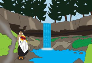
First, we have a submission idea from third-year student Jay Hughes.
Hughes suggested the flag should “emphasize Minnesota’s Indigenous history,” as well as honor the importance of lakes and rivers in Minnesota. Our rendition of this, closely resembling Minnehaha Falls, offers true immersion into the nature of Minnesota while paying homage to the history of Indigenous people in our state.
A nice design honoring the history and landscape of Minnesota. What’s not to love?
Pardon my French
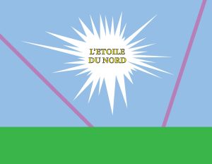
“L’Etoile Du Nord” means “The Star of the North” in French and was featured on the old state flag.
A few people had mentioned keeping the old state motto in the mix, but no one got as specific in their request as Eric Turner.
“A simple and modern flag design for the state of Minnesota that follows vexillology principles. The flag should have a bright blue background symbolizing Minnesota’s lakes. At the bottom, add a horizontal band of vibrant green representing the state’s farmlands and forests,” Turner said.
Turner went on for another paragraph, give or take, and said the flag should forego any text, rather referencing the motto purely through imagery. But, Turner’s design idea and the text suggestion from others really make it come together, don’t you think?
An ode to days gone by
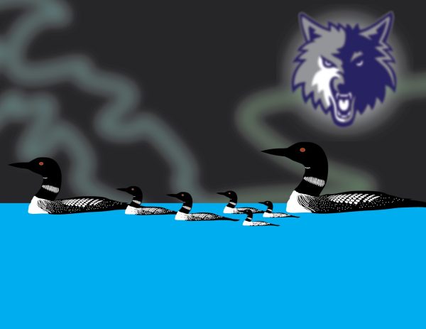
Must I sully this image with any outer context? Loons and the old Timberwolves logo. Many mentioned both and got what they desired.
A beautiful flag for a beautiful state. Bask in its glory.


Grace
Jan 31, 2024 at 10:18 am
These are fun designs, but I hope we can all agree that the official finalists for the new state flag are all better than the current one. Plus, it’s important to remember that the design has to be simple and easy to recreate, otherwise you can’t see it from long distances and it isn’t as iconic and recognizable. New Mexico has a great state flag, for example.
Poopy
Dec 1, 2023 at 1:28 am
Spencer, your writing is so funny and it goes so criminally unappreciated.