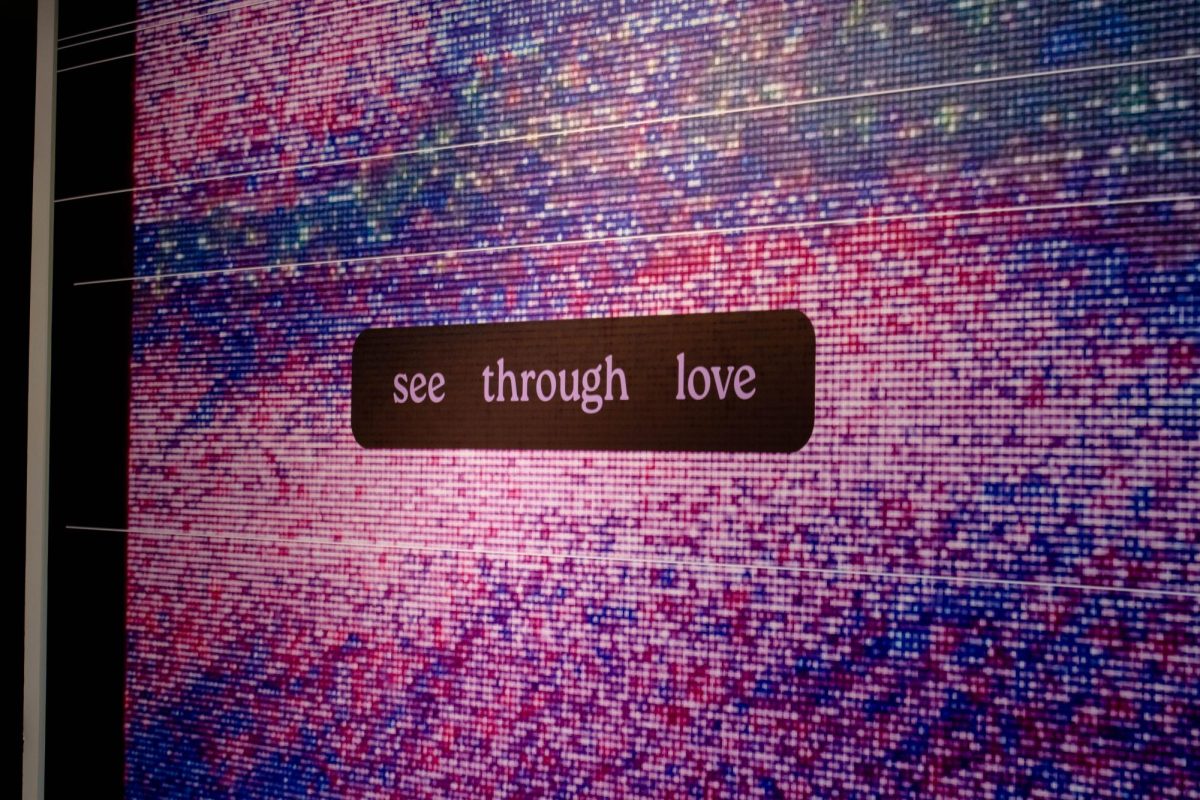
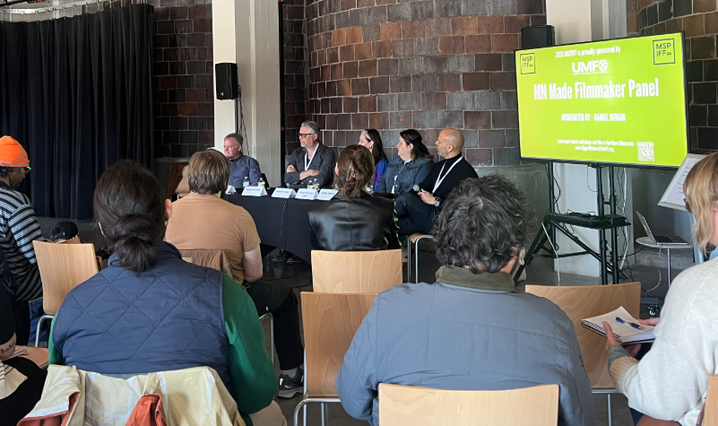
When stepping into the Goldstein Museum of Design, the average gallery-goer is confronted with something unique. The gallery does not force the viewer to analyze the art on display. Rather, the art is analyzed and its intent, purpose and result are all clear-cut.
Students at the University have the once-in-a-lifetime chance to see the work of professional designers mutate from student to professional work in “Form/Inform,” an exhibit displayed by the Goldstein Museum of Design.
From typographical research to a vacuum machine experiment, the museum is now displaying pieces which chart the trajectory of prestigious graphic designers. This exhibit is presented as a chance for those experienced designers to share their knowledge with younger designers.
Graphic design is a rapidly growing field. With the history of the Internet still being written and the realm of computer science constantly evolving, graphic design is taking on new shapes and forms. There were 492,000 design jobs in 2000, according to the U.S. Department of Labor. The Department of Labor projects the field to grow another 21 to 35 percent by 2010.
With the number of graphic designers rising, it is vital for students to understand how to succeed in the graphic design. “Form/Inform” ingeniously takes the student work of professionals, exhibits it, and allows the professional to speak out about what has helped them succeed.
“Form/Inform” focuses on change and adaptation to new ideas. The exhibit gives each professional space to display two pieces of design. A wooden “A” marks their student work, while “B” denotes professional pieces. Each designer has a written explanation of the process involved in creating the piece, the reasoning behind it and the outcome.
Written in first-person narrative, the professionals give real-life wisdom to the work at hand.
With the many words of wisdom thrown about in the exhibit, Paul McNeil, designer of IE logo in London, gave some helpful advice in the land of design work. “The distance between the idea and the solution should be always as short as possible,” he said.


