
The candidate is young and his font is Futura. His color palette is a soothing and serious blue combined with a progressive green, tailored to meet the needs of both the families and students that make up his ward. The candidate is Allen Kathir , one of many across Minneapolis running for a seat on city council. Using art to communicate political messages is an old game. From the font to color selection and images from the district used, campaign materials are wrought with symbolism. The most obvious is a candidateâÄôs use of color. Green could indicate a commitment to âÄúgreenâÄù values or the freshness of their candidacy. Blue often is used as the entrenched representation of the DFL just as red would be for the GOP . In KathirâÄôs campaign, âÄúthe strategy was not about being flashy but was about simplicity and accessibility,âÄù explains Alyssa Diamond, a journalism senior with a minor in graphic design who designed KathirâÄôs materials. The cool colors and simple, classic design of the Kathir campaign were selected to communicate his no-nonsense strategy. One of the biggest challenges for the candidates in this off-year election is creating excitement for their campaigns. Given the generally small turnout in these city council elections, mobilizing just a few hundred more voters could decide the election. Some candidates are looking for more radical and expressive ways of getting their message out. One of these candidates is Dan Alvin, running in UptownâÄôs Ward 10 . For Alvin, the choice of message was easy. His campaign poster is an orange and green pastel portrait of himself. In the four corners of the design sit a bicycle, a flower, the Uptown Theater and a buffalo, the symbol of the Independence Party . The poster was designed by local artists Adam Turman of âÄúCycle the Twin Cities âÄù fame who has designed works for the North Star Roller Girls and the Surly Brewery Co., among others. According to Alvin, his ward includes one of the highest concentrations of artists in the world, so such an artistic approach seemed natural. âÄúThe poster represents who I am as a person and as a candidate,âÄù Alvin said. âÄúIâÄôve loved TurmanâÄôs work for years and I wanted to have his style represent myself as a candidate.âÄù For Alvin, communicating that he represents a change in politics as usual as he sees it is best done through his drastic departure from standard campaigning. The rest of his campaign material reflects his stance on sustainability and utilitarianism. âÄúI may lose the election, but I donâÄôt want all of my campaign stuff to just become garbage,âÄù says Alvin, whose campaign materials this year are bookmarks and magnets. âÄúMagnets will stay on your fridge for a decade after this race is over.âÄù The campaign to get the average citizen excited about voting is a difficult one and, given voter turnout rates, it may be one that falls on deaf ears. As the election draws to a close early next month, all this colorful campaign literature will slowly cover the city like the colorful leaves about to be swept up.
The art of the campaign
How candidates use visual design to convey meaning.
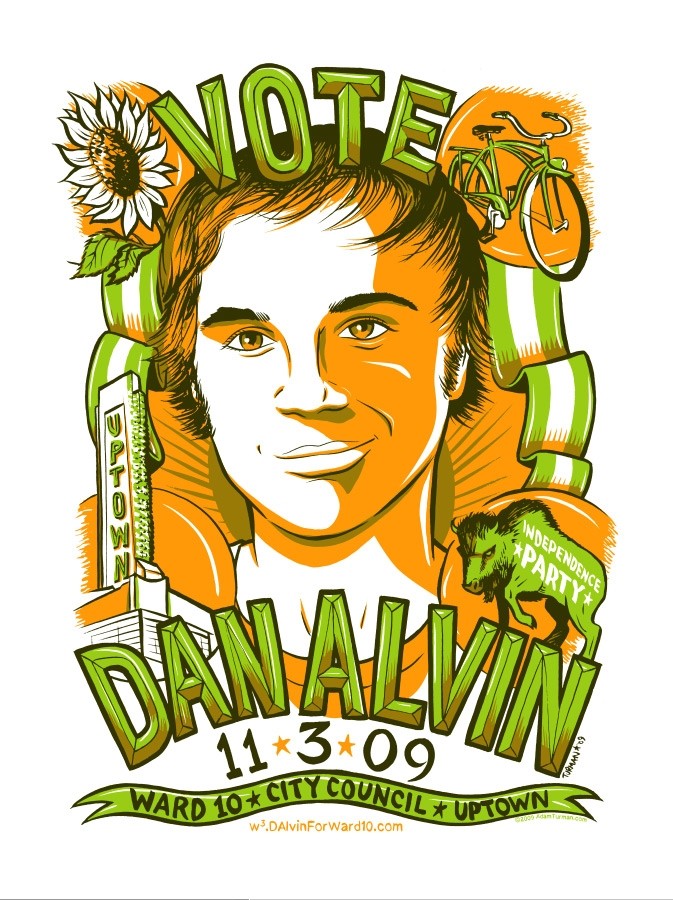
Candidate Dan Alvin hopes his colorful poster will speak to Uptown voters. PHOTO COURTESY DAN ALVIN
Published October 21, 2009
More to Discover