The work of internationally renowned architect Frank Gehry never fit neatly into a box and defies the boundaries of labels.
“My approach to architecture is different,” Gehry once said. “I want to be open-ended. There are no rules, right or wrong.”
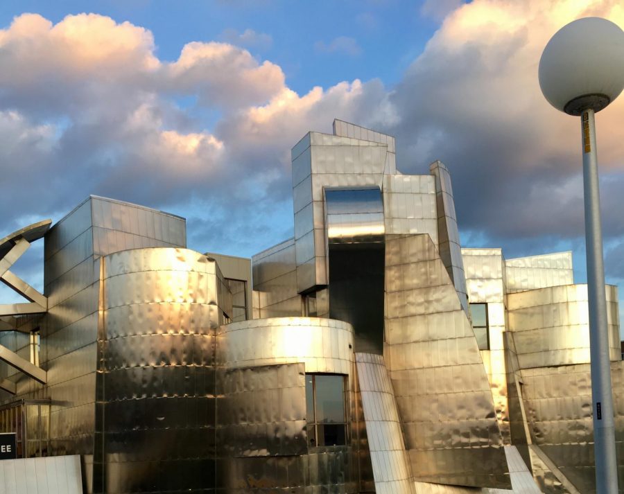
The Weisman Art Museum (WAM), designed by Gehry, is a clear manifestation of this abstract and innovative take on architecture. The University of Minnesota campus gem hallmarks Gehry’s infamous style with its fluid and innovative design, a step outside the box that’s indicative of the University’s values at large.
Bearing the name of philanthropist and art patron Frederick R. Weisman, the museum’s construction was completed in 1993. But WAM’s collection preceded the building it now calls home: it began as the University Art Gallery, located in Coffman Memorial Union.
Diane Mullin, WAM’s senior curator, is responsible for the museum’s exhibitions and collections. Mullin explained that former WAM director Lyndel King played a large role in getting the gallery moved to its current location.
“She felt that there should be a freestanding art museum for everybody on campus, not just an art department,” Mullin said. “She was the driving force for that. She had a vision, and she said that we needed a building.”
After hearing about other works Gehry had done in Minnesota, like the Winton Guest House, King felt as though he should be commissioned for the project.
“She felt that he was a very important architect because he used everyday things like stainless steel and chain link fences and took them out of context,” Mullin said.
This ingenuity is apparent in all of Gehry’s work, whether in terms of the materials he used or the abstract nature of his designs, and WAM is no exception. The museum’s most defining characteristic is its glistening metal facades where its sharp, geometric edges work in tandem with fluid curvatures to create a reflective beacon at the heart of campus.
Tom Fisher is a professor of Architectural Theory and Urban Design at the University. Before he was a professor, Fisher worked as the editorial director of Progressive Architecture Magazine and he spoke with Gehry for the publication multiple times. During their conversations, Fisher learned a lot about Gehry’s artistic inspiration and the reason behind many of his design choices.
“I was on the bridge looking at the building with him, and I asked what the inspiration was for that wrinkled metal facade, and he said ‘look down.’ If you look at the cliff face of the Mississippi right below the Weisman, the rock has the same kind of grey, fractured, angled appearance,” Fisher said. “He was making the argument that his building was contextual, because he was representing in metal the same kind of forms that existed on the cliff face right below it.”
Fisher noted that this interaction spoke to Gehry’s tendency to mimic natural forms in his work.
“A lot of his buildings have scale-like metal cladding that look like the scales on a fish,” he said. “I think he really likes the form of fish because it’s a body that’s evolved to move.”
Gehry’s work began to utilize the appearance of motion more as technology evolved. Eric Amel, a Contemporary Architecture History professor at the University, explained that the riverside metal facade was all hand-drawn. This side of the building uses descriptive geometry, which means that all of its forms can be developed into flat surfaces.
The building’s north-facing metal side, which looks towards Bruininks Hall and other campus buildings, was part of a 2011 expansion to the museum. Amel said that at this point, computer technology had evolved that allowed Gehry to give the addition a more motion-like appearance, made up of fluid metal ribbons and curves.
The differences between these two sides of the building speak to the innovative nature of Gehry’s work and how he’s willing to adapt his style with the changing technological landscape.
“The side facing the river has a certain Gehry voice to it from the 1990s, and the side facing Bruininks is the next generation of Gehry,” Amel said. “He’s willing to combine both of those voices in the same building and be comfortable with it.”
Outside of its reputation as an avante-garde art piece on campus, Mullin noted that the sense of innovation and creativity preserved within the WAM building is an attestation of the University’s core values.
“It’s cutting edge, and the University is always cutting edge, so I think it makes sense to invest in that kind of thinking,” Mullin said. “Gehry questions traditions — he doesn’t just uphold them. That’s what a good University does.”


